
8 Paint Colors to Skip in a Living Room (Plus Warmer Options to Try)
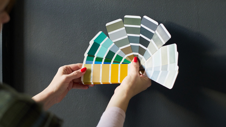
Understanding the Impact of Paint Colors on Living Room Atmosphere
Living rooms are more than just spaces for sitting and watching TV; they're areas where we relax, entertain guests, and create memories. To ensure these spaces feel welcoming and comfortable, the choice of paint color plays a crucial role. The right colors can enhance the warmth and tranquility of the room, while the wrong ones can create an unwelcoming or even stressful environment.
Design experts have identified several paint colors that may not be ideal for living rooms due to their potential to negatively impact the overall atmosphere. These include cool grays, deep navy, bright whites, primary shades, neon colors, dark purples, reds, and glossy black paints. Each of these has its own set of drawbacks when used in the wrong context.
Avoid Cool Grays Because They Take Away The Cozy Factor
Cool grays, often referred to as "Millennial Gray" on social media, have been a popular trend in interior design. However, they might not be the best choice for a living room. According to Christopher Boutlier of Christopher Boutlier Interiors, cool grays can make a space feel flat and lifeless. This lack of warmth can be counterproductive in a room meant for relaxation and connection.
Gala Magriñá, a holistic interior designer, also highlights that cold, flat grays can create a sterile and emotionally distant environment. To maintain a warm and inviting space, she suggests opting for smoky taupe instead of cool grays. Alternatively, a deeper green like Gondola Ride by Benjamin Moore can add depth and coziness without overwhelming the area.
Shun Harsh, Bright Whites, As They Make Living Rooms Seem Unfinished
While white is often seen as a safe and versatile choice, overly bright or harsh white hues can create a clinical and unfinished look. Cathleen Gruver of Gruver Cooley explains that such colors can make a living room feel like a dentist's office or a research lab rather than a relaxing space.
To achieve a fresh and welcoming environment, softer undertones like creamy off-white or warm ivory are recommended. These shades provide the brightness of white without the sterility. For those who want to incorporate white into a cooler palette, Eider White and Crushed Ice from Sherwin-Williams offer a softer, calmer alternative.
Reject Deep Navy And Charcoal In Small Rooms Because They Look Heavy
Deep navy and charcoal colors, while elegant, can make small living rooms feel cramped and enclosed. Cathleen Gruver notes that these colors absorb light and can create a heavy, overwhelming atmosphere. Instead, she recommends using muted earthy tones like soft terracotta, olive, or clay to add depth and personality without making the space feel smaller.
Color psychology supports this approach, as natural tones evoke feelings of relaxation and comfort. By choosing warmer, more inviting shades, you can create a space that feels balanced and harmonious.
Give Primary Shades A Pass, Since They Can Be Too Strong And Overwhelming
Primary colors like red, yellow, and blue can be too intense when used on all four walls. Christopher Boutlier warns that these colors can feel overwhelming and chaotic, especially when combined with artificial lighting. He suggests using deeper, softer versions of these colors to create a more sophisticated and inviting atmosphere.
For example, a saturated scarlet or rich crimson can add drama without being overpowering. Similarly, moody indigos or softened slates can bring a calm, cocooning quality to the room.
Pass Up On High-Energy Neon Colors In Relaxed Spaces
Neon colors, while vibrant and eye-catching, can be too stimulating for a living room. Cristiana Crin of Perpetuum Designs advises against using high-intensity pigments in relaxed spaces, as they can be tiring and distracting. Instead, she recommends softer alternatives like Benjamin Moore’s Golden Straw, which offers a balance of brightness and comfort.
Angie Kreller of Yabby also suggests opting for pastel versions of neon colors to maintain a sense of tranquility and calm in the space.
Rule Out Dark Purple, Since It's Hard On The Eyes
Dark purple, while stylish, can be challenging to decorate and may cause visual discomfort, especially in north-facing rooms with limited natural light. Cristiana Crin explains that dark purples can create a moody atmosphere that's unsuitable for a relaxing living room. She suggests using softer shades like lilac as a compromise, allowing for more flexibility in decor choices.
Keep Away From Reds, Since They Can Be Too Energizing For Living Rooms
Red is a powerful color that can energize a space, but it may not be ideal for a living room intended for relaxation. Angie Kreller notes that red can create an intense and stimulating environment, which may not align with the goals of a peaceful retreat. Instead, she recommends using terracotta, which offers a grounded and earthy feel without the same level of stimulation.
Choosing High-Gloss Black Paint For Your Living Room Will Highlight Dust Particles
While glossy black paint can make a bold statement, it may not be the best choice for a living room. Olga Doykhen of Olga Doykhen Interior Design warns that glossy black walls can reflect light unevenly and highlight dust particles, making the space difficult to clean. Matte finishes like matte charcoal or deep, muted brown-black are better alternatives, offering a similar aesthetic without the maintenance issues.
By carefully selecting the right paint colors, you can create a living room that feels warm, inviting, and conducive to relaxation. Whether you choose neutral tones, earthy shades, or subtle variations of bolder colors, the key is to find a balance that supports the mood and function of the space.
)
Post a Comment for "8 Paint Colors to Skip in a Living Room (Plus Warmer Options to Try)"
Post a Comment